Moolah is a personal finance app which aims to help financially independent young adults learn healthy spending habits and understand complex financial topics.
Date
January - February 2025
Contributors
Theo Kocher
Main Responsibilities
User Research
User Testing
UI Design
User Testing
UI Design
Tools Used
Figma

Problem Statement and Ideation

The prompt we were given was "Taking Care of my Money." The first step of this process was to begin exploring how we would narrow down this broad topic to something more specific. We did this by understanding what groups of people could we target and what is their relation to money. One group of people that stood out to us, partly because of the age of people we surround ourselves with, was young adults who are becoming financially independent. After selecting this target group, we began to understand the different ways in which they interact with money and the other potential stakeholders involved. We mapped these relationships out to fully explore this user group.
User Research and Insights
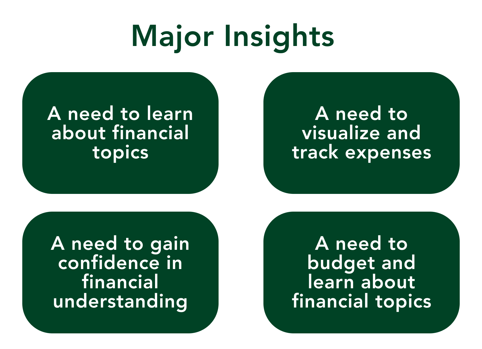
Once we decide to dive deeper into understanding newly financially independent young adults, we did five user interviews to understand the relationship that these individuals have with money and spending. We interviewed individuals who were between the ages of 23-25 with different levels of expertise and experience with managing their own finances. Through these interviews, we identified key insights that helped direct the rest of our process.
We next dived into journey mapping to create more specific personas of our target users based on the insights and observations from our user interviews to understand potetial user flows.
We next dived into journey mapping to create more specific personas of our target users based on the insights and observations from our user interviews to understand potetial user flows.
HOW MIGHT WE STATEMENTS

Wireframing and Design Generation
SKETCHES
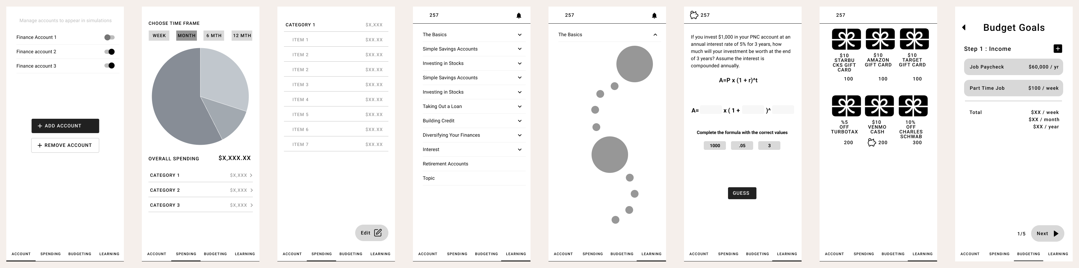
After generating insights, we decided to create a multifunctional app which would not only help users track their spending, but would also help them learn about complex topics, budget their money, input receipts, and earn rewards. Some preliminary sketches are seen to the right.

3 Main Features
1. A pie chart which to help users better visualize where their money is going.
2. A gamified learning page with sections for quick access in-app resources to learn about complex financial topics. Users would be able to earn points and rewards for completing tasks.
3. A budget feature to help users save money by helping them calculate a spending limit that takes into account their income, fixed expenses, and how much money they want to save.
WIREFRAMES
User Testing
After testing the wireframes with potential users, we identified some features that needed clarification (below are some sample quotes from these tests). Users did not like the real-world reward feature, as they said it didn't seem easy from a business perspective, and may encourage users to complete tasks for the wrong reasons. Users, however, really liked the visualization features, which we planned to enhance for our final designs. Users also indicated some flaws in our user flows and navigation options which we aimed to fix.

First-Generation High Fidelity Designs


Our first draft high-fidelity models features a strong branding identity with the use of many shades of green which is a universal color to represent money. We tested this prototype with potential users and gathered insightful feedback which inspired our final high-fidelity design.
Some users mentioned that the use of green was overboard, causing important pieces of information t become buried among the graphics and other symbols. Other users mentioned that there seemed to be a few inconsistencies with font size and placement, which could be enhanced to create a more consistent experience.
Some users mentioned that the use of green was overboard, causing important pieces of information t become buried among the graphics and other symbols. Other users mentioned that there seemed to be a few inconsistencies with font size and placement, which could be enhanced to create a more consistent experience.
Final High-Fidelity Designs

I revised my high-fidelity models based on more user feedback to refine some elements and improve the visual appearance of the app's features. Many users mentioned that some visual features go lost and it was at times hard to understand what to focus on due to the darker green background. I updated the color palette to include lighter tones, and used darker green colors to highlight text and other important information. I improved the visual hierarchy of certain text features to stay more consistent from page to page to help the user better understand what information was the most important to view.
