
NaviCare is an app designed to help healthcare users better understand and navigate their healthcare plan, taking users through a step-by-step process of helping find them the best care that is covered within their plan.
Date
February - May 2025
Contributors
Individual Project
Main Responsibilities
User Research
User Testing
UI Design
User Testing
UI Design
Tools Used
Figma

PROBLEM STATEMENT
Understanding the intricacies and details of different plans can be confusing for both consumers of healthcare as well as healthcare providers, and many companies do not provide easy ways of finding essential information.
SOLUTION
To help users through the process of finding the right care based on their healthcare guidelines, I created an app which aimed to clarify how users search for care within their specific healthcare plan guidelines.

During the initial phase of user research, I interviewed 4 people and surveyed 16 more regarding their experience navigating their healthcare plan. My main goals were to understand the experiences of others when receiving care at healthcare facilities, what types of procedures and types of care are most common, and the ways in which people find the right type of care within the coverage guidelines of their plan.
"All of the information is out there, but you need to know the right questions to ask and have to go down a variety of paths to find the right information."
"Some of my patients don’t have a clue about their plans and what is covered."
"I have experience working in the healthcare industry, and I still get tripped up with unexpected things not being covered."
"It seems like something different happens at the doctor every time, and some issues take weeks to resolve."

GOALS AND USER FLOW

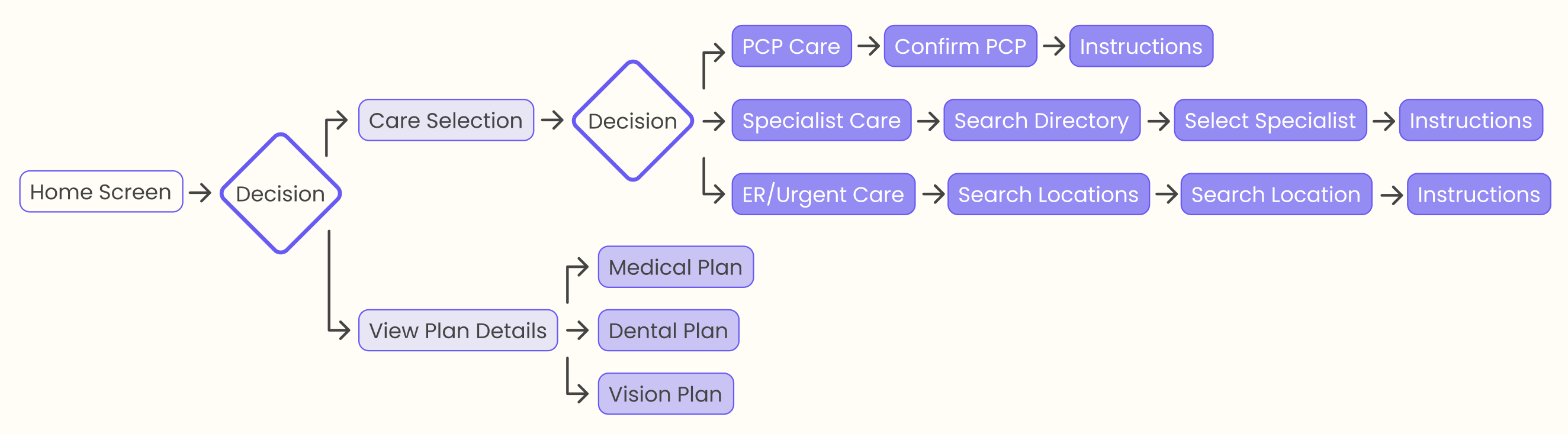
The initial low-fi screens I created explored how users would search for in-network specific care through the app. I envisioned taking users through a step-by-step process to help them find the right care under the coverage guidelines of their health plan based on their specific needs.
General Search
To find in-network care for user’s specific need.
To find in-network care for user’s specific need.
Option 1
PCP-Directed Care
PCP-Directed Care
Option 2
Specialist Search
Specialist Search
Option 3
Emergency/Urgent Care
Emergency/Urgent Care

Major input from users:
1. Buttons on search screen feel like they are taking me to a separate page.
2. I would like a search that gives me suggestions if I’m not sure what the right type of care is.
3. What if I am not as knowledgable about what care I need?
4. I would like to see specialist ratings when searching.
1. Buttons on search screen feel like they are taking me to a separate page.
2. I would like a search that gives me suggestions if I’m not sure what the right type of care is.
3. What if I am not as knowledgable about what care I need?
4. I would like to see specialist ratings when searching.

Visual Exploration
I wanted this app to deliver a pleasurable experience with not only a smooth user flor, but a soft color palette that differs from the current apps and websites used for healthcare-related companies and businesses. I experimented with a variety of colors with a glassy background to create a soft effect.
I wanted this app to deliver a pleasurable experience with not only a smooth user flor, but a soft color palette that differs from the current apps and websites used for healthcare-related companies and businesses. I experimented with a variety of colors with a glassy background to create a soft effect.
Search Decision
Choosing how to receive care.
Choosing how to receive care.

Option 1
PCP-Directed Care
PCP-Directed Care
Option 2
Specialist Search
Specialist Search
Option 3
Emergency
Emergency

USER TESTING
Major input from users:
1. What if I could see more essential information just at a glance when I open the app?
2. The “Select Treatment Path” screen seems redundant.
3. I like the parts that emphasize pricing and instructions. That would help me know the right thing to do.
1. What if I could see more essential information just at a glance when I open the app?
2. The “Select Treatment Path” screen seems redundant.
3. I like the parts that emphasize pricing and instructions. That would help me know the right thing to do.
STYLE GUIDE

HOME SCREEN

The home screen of the app has two main call-to-action buttons to help direct users to either search for care, or view their plan details. Additionally, more timely information such as upcoming appointments and the status of submitted referrals will appear on the home screen to provide reminders and quick access to important information.
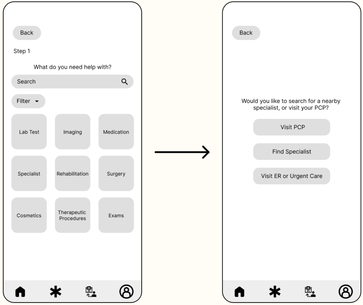
SEARCH FOR CARE

The search for care flow helps users search for certain types of care for whatever ailment they are dealing with. A simple search bar at the top allows users to type in keywords, which will pull up suggested results. Within each result are dropdown buttons allowing the user to refine their care search by selecting the type of care they would like to receive.
PCP-DIRECTED CARE
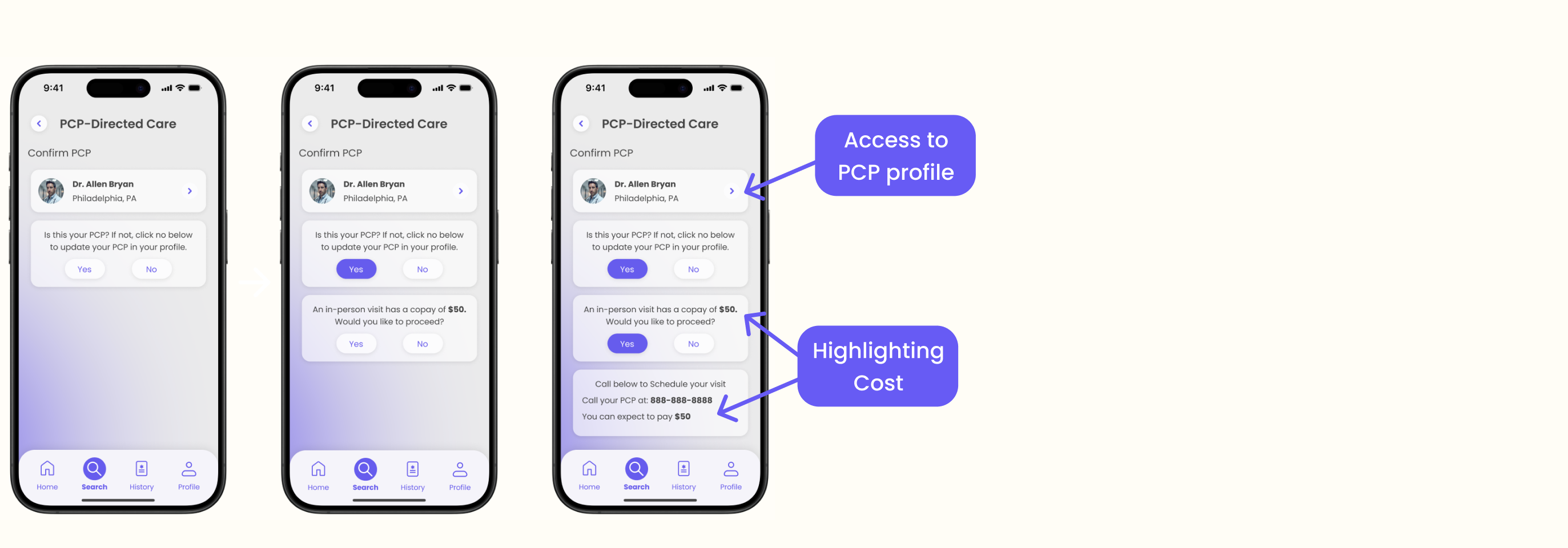
The PCP-directed care option walks the user through a few key steps in guiding them to get care from their PCP. Once their PCP is confirmed, they are alerted of the copay associated with a PCP visit based on their healthcare guidelines and provided the phone number of the PCP’s office to make a quick call right from the app.
SPECIALIST SEARCH
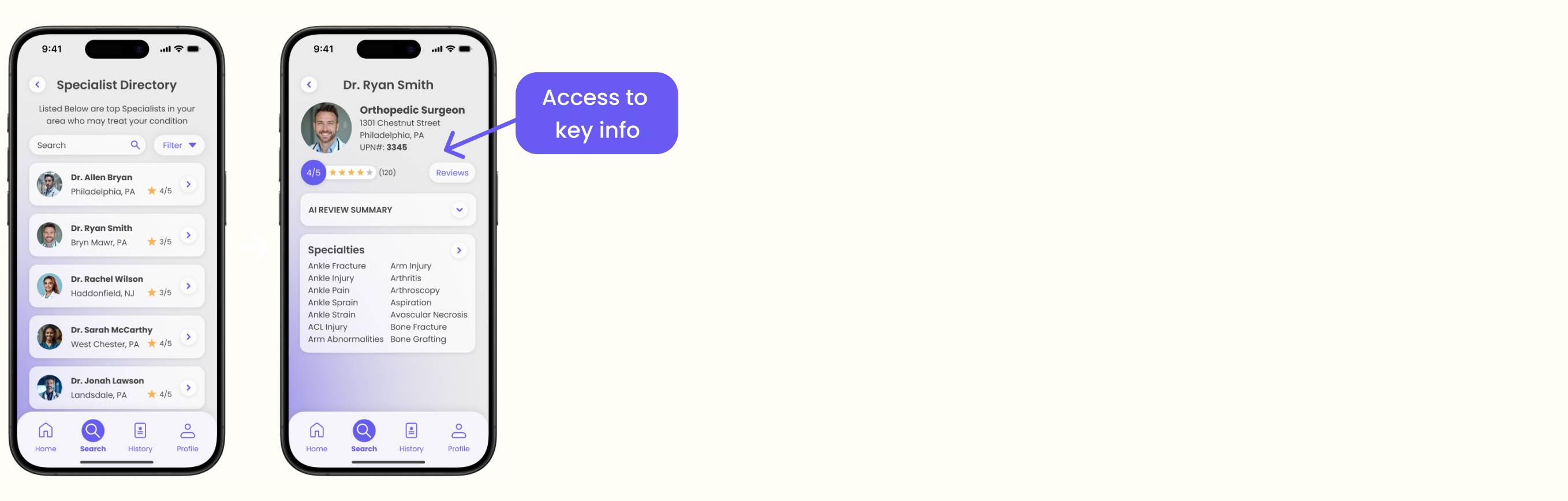
The specialist search feature allows users to search for specialists in the area who might be able to treat their condition under the coverage of their healthcare plan. They list would be pulled from a healthcare-plan associated directory to ensure plan coverage. They are able to see the doctor’s working address, reviews, conditions they specialize in, and their UPN number, an essential part of the process if they need a referral.
EMERGENCY ROOM / URGENT CARE

This final search feature allows users to toggle between a search for emergency rooms or urgent care centers nearby that would have coverage under their health plan guidelines. The search screen features a search bar, map, and highlights on the map the different locations and lists them below. Once the user clicks on their preferred location, they are given easy access to directions and a phone number, and are also given instructions on what to bring and are notified of the price or coinsurance associated with the visit. The user has an option to add the visit to their home screen for easy access to directions, and other information.